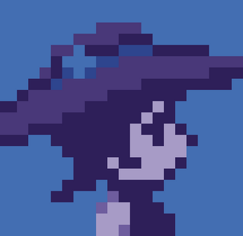
Metroidvania Month 16 entry test (arachnophobia warning)
THE GAME USES ONLY ARROW KEYS AND X KEY
Here's my prototype for the GameJam. Had a lot of fun making the pixelart and a lot of confusion figuring out the coding. All in all, quite an enjoyable experience I sure once again learned a lot from!
That's the first project I feel like I could call somewhat acceptable at least in its prototype phase. I might work on it further, though I sure need a break first after it fell apart x times during transfer from Unity to Itch.
LAST HOUR UPDATE:
I've removed the clunky dashes and cut down keys used to only X, its action depends on the state character is in. Look at the sprite to check if you can shoot poison or jump higher than normal. 3,5 objects are destroyable.
Congratulations if you manage to reach the final hallway.

Comments
Log in with itch.io to leave a comment.
much better in the sense that the jumps are do able but I think having the shoot and jump tied to the same button is awkward.
Thanks once again for giving it another try! I'll definitely keep that in mind next time I think about mapping buttons like this. Cheers :)
The art is great and Iove the animation. The Jumping is kind of hard though.
Thank you so much for the praise and the feedback! :)
I've just updated the game in the final hours of the jam so if you're interested in comparing if the jumping is acceptable now it would be great to read your opinion.
I wish you a nice day and thanks for stepping in!
i think in this days you can make the movement of the player better.
(BTW don't steal art because is not allowed in the jam)
hope you can make it better : ]
Hey, thanks for the feedback! Could you specify what do you mean by "better" or what exactly is bothering you the most about the movement?
I haven't stolen anything and the singular easteregg placeholder jpg I named and referenced will be replaced before the jam time ends, if that's what you mean.
you stole the art because i used the witch and the textures are waaaaaaaaaaaaaaay disconnected, that means you are using multiple packs with different characteristics and mix them together.
also the controls are a bit strange and by "better movement" i mean the character physics are ok but the jump is kinda wierd and cluncky at times.
hope my feedback is helpfull :]
I literally made those sprites by myself during the jam time but guess I could consider it a compliment if you really think those sprites of mine are worth being in a pack. Ironically, that really helped my low self-esteem :)
I still have sketches and all if there was any need for me to prove it or you can even check my previous lil projects to see the consistency. Backgrounds and sprites are made with the same color palette I picked for this jam. The sprite size of an inexperienced pixelartist isn't a good reference point for hurtful accussations like this.
I'd like to know, though, how exactly did you "use" my "witch"?
Either way thanks for the feedback again.
so, if you say that you make the art one thing you can make is level up the game art:
-change the witch because it is in high resolution and is super disconnected with the other things
- don't oversize the 16x16 objects, just make the camera smaller
- make the writes is pixel art
- make something to caracterize the objects you have to interact with, for example a dialogue image when the player is near that object
Hello again, I've finally updated the final version for the jam if you're interested in comparing if movement is still as clunky.
I was thinking about your points about the visuals and I tried at least resizing and refitting the sprites into the scene a little, since I had no plans on making the backgrounds more detailed in remaining time. Now there are 2 main objects to interact with so I also added a little animation to make it clearer when they're activated.
Wish you a nice day and I really hope I cleared out your doubts about the art :)